
Ever walked into a room that felt calm without you being able to say why? No clutter, nothing screaming for attention, just… peace. There’s a decent chance that room had some Wabi Sabi influence in it, even if the owner never used that word. This design philosophy has quietly taken over home décor conversations, and once you understand what it actually means, you start seeing it everywhere.
The Basic Idea Behind Wabi Sabi
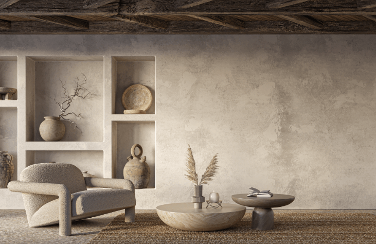
Wabi Sabi comes from Japan, and it doesn’t translate into English cleanly. The short version: it’s about finding beauty in things that are imperfect, incomplete, or aging. A cracked bowl. A weathered piece of wood. A wall with visible texture instead of a flawless finish.
It sounds simple, but it’s actually a pushback against something we’ve all been trained to want — perfection. Glossy, symmetrical, flawless. Wabi Sabi says none of that is required for something to be beautiful. Sometimes the imperfection is the beautiful part.
Applied to art, this means pieces that embrace rough edges, muted and earthy tones, uneven textures, and asymmetry. Nothing looks mass-produced or overly polished. It looks like it was made by a hand, not a machine, even when it’s actually a print.
Why It’s Suddenly Everywhere in Home Décor
A few things are happening at once here, and they’re feeding off each other.
People Are Tired of “Perfect” Interiors
For years, a lot of interior design content pushed pristine, catalog-perfect spaces. Everything matching, everything spotless, everything staged. It got exhausting, honestly. Wabi Sabi is almost the opposite — it gives you permission to have a home that looks lived-in and calm rather than showroom-ready. That’s a relief for a lot of people.
Minimalism Needed More Warmth
Minimalist décor had its moment, but pure minimalism can feel a little cold if you’re not careful — lots of white walls, sharp lines, not much personality. Wabi Sabi solves that problem. You keep the simplicity, but you add texture, imperfection, and warmth back into the mix. It’s minimalism with a soul, basically.
Slow Living Is Having a Moment
There’s a broader shift toward slowing down — fewer trends, more longevity, buying things you’ll actually keep. Wabi Sabi fits that mindset perfectly, since the whole philosophy is about appreciating things as they age instead of constantly replacing them for something newer and shinier.
What Wabi Sabi Art Actually Looks Like
If you’re picturing something specific, here’s what tends to show up again and again:
- Muted, earthy color palettes — think clay, sand, moss, charcoal, and soft off-whites rather than bright or saturated colors
- Visible texture — raised plaster, brushstrokes you can actually see, uneven surfaces that catch the light differently depending on where you stand
- Asymmetry — shapes that don’t line up perfectly, edges that aren’t crisp, compositions that feel organic instead of engineered
- A sense of age or weathering — even in new pieces, there’s often a deliberately worn or aged quality to the finish
If you’re browsing for this style, Wabi Sabi art usually stands out immediately from typical wall art because it doesn’t try to look flawless. The texture alone tells you it’s different — it’s meant to be felt as much as seen.
Wabi Sabi vs. Traditional Minimalism
People mix these two up a lot, so it’s worth clearing up.
Traditional minimalism is about reducing things down to their simplest form — clean lines, sharp edges, often quite geometric. It can feel precise, almost mathematical.
Wabi Sabi keeps things simple too, but it’s not precise on purpose. It leans into irregularity. A minimalist piece might have a perfectly straight black line on white canvas. A Wabi Sabi piece might have a rough, slightly uneven line with visible texture and a warmer, more muted background.
Neither is better — it just depends on whether you want your space to feel crisp and modern or soft and grounded.
How to Bring Wabi Sabi Into Your Home Without Overdoing It
You don’t need to redecorate your entire house to get this look. A few small choices go a long way.
Start With One Statement Piece
A single large textured canvas above your sofa or bed can shift the whole feel of a room. You don’t need five small pieces scattered around — one thoughtful piece usually does more work.
Stick to a Limited, Warm Palette
Wabi Sabi doesn’t do bright neon colors or high contrast. If you want more vibrancy in the room, that’s fine — just keep it in a separate area, or check out something like colorful wall art for a different room where you want more energy and less quiet.
Pair It With Natural Materials
Wood, linen, stone, unglazed ceramics — these all sit well next to Wabi Sabi art because they share the same imperfect, organic quality. Avoid pairing it with anything too glossy or high-shine, since that tends to clash with the whole vibe.
Leave Empty Space Around It
Don’t crowd a Wabi Sabi piece with a busy gallery wall around it. Part of the appeal is the calm, and that calm needs room to actually exist. Let the piece breathe.
Where It Works Best in Your Home
Bedrooms are a natural fit, since the whole point of Wabi Sabi is calm and rest. Living rooms work well too, especially if you already lean toward neutral, natural furniture. Home offices are an underrated spot — the muted tones and texture can make a workspace feel less sterile without becoming distracting.
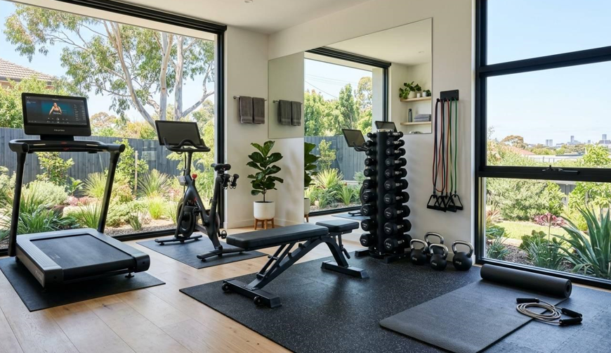
It’s a tougher fit in spaces meant to feel bright and energetic, like a kids’ playroom or a home gym. Not impossible, just not the most natural pairing.
See also: How Businesses Can Build a More Effective Vulnerability Management Process
FAQ
Is Wabi Sabi just a trend, or is it here to stay?
It’s rooted in a philosophy that’s been around for centuries in Japan, so it’s not really a fad in the traditional sense. The current spike in popularity in Western décor might ease off eventually, but the underlying idea — appreciating imperfection — tends to stick around because it’s not really about aesthetics alone.
Can Wabi Sabi art work in a modern or contemporary home?
Yes, and it often works especially well there. The contrast between clean modern architecture and a textured, imperfect piece of art can actually make both elements stand out more.
Do Wabi Sabi pieces have to be neutral colors only?
Mostly yes, though there’s some flexibility. Muted, dusty versions of color (a faded terracotta, a soft sage) still fit the philosophy. It’s the saturated, high-contrast colors that tend to break the mood.
At its core, Wabi Sabi art isn’t really about a specific look — it’s about a mindset. Once you stop chasing perfect and start appreciating a little roughness around the edges, your space usually ends up feeling more like home anyway.


 By
By

 By
By